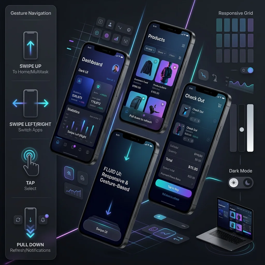
Mobile internet traffic now accounts for over 72% of global web browsing. In 2026, Mobile-First Web Design is not a responsive layout technique bolted onto a desktop comp — it is Google’s primary indexing standard and the way you build for the device most of your visitors are holding.
Designing for mobile devices first forces web developers to prioritize essential content, eliminate visual clutter, and engineer sub-second page interaction speeds. The strategy and principles this assumes live in our mobile-first design strategy guide; this post is the implementation half — the CSS, the asset pipeline and the DOM decisions, in the order you would actually make them.
1. Core Architectural Pillars of Mobile-First Web Design
Three mechanics carry a mobile-first build: fluid type that scales without breakpoints, controls sized for a thumb rather than a cursor, and a base document that works before enhancement loads. Get those three right and the rest of the implementation is detail; get them wrong and no amount of tuning rescues the experience.
To deliver an exceptional smartphone experience while maintaining desktop scalability, modern web design adheres to three core architectural pillars:
Fluid Typography & Elastic CSS Layouts
Utilizing modern CSS viewport units (clamp(), rem, vw) to automatically scale typography smoothly across smartphone, tablet, and widescreen desktop monitors without horizontal scrollbars. The point is that type stops having a breakpoint: instead of one font size for phones and another for desktops with a jump between them, a single clamp expression interpolates across the whole range.
Thumb-Zone Usability & Touch Target Padding
Placing key navigation links and purchase triggers within natural thumb-reach zones. Ensuring interactive buttons satisfy accessibility criteria verified with our Color Contrast Checker. Reach is the half teams forget: a control that is big enough but sits in the top-left corner is unusable one-handed on a tall phone.
Progressive Enhancement & Asset Caching
Loading minimal HTML skeleton structures and deferred CSS styles first on mobile cellular networks, progressively enhancing layout features as screen real estate expands. Everything below the fold waits; everything required to read the page does not.
2. Technical Mobile SEO & Responsive Viewports
Search crawlers evaluate mobile user experiences through automated mobile-first indexing audits, and they read the same DOM your phone renders — so viewport configuration and clean breakpoints are SEO work, not just styling work. A page that reflows correctly with no horizontal overflow passes the rendering test; a desktop layout squeezed into a phone does not.
- Viewport Meta Tag: Enforcing
<meta name="viewport" content="width=device-width, initial-scale=1.0">. Without it the browser renders at desktop width and scales the whole page down, which makes every target below the 48px floor. - Responsive Media Queries: Structuring clean CSS breakpoints without inline style overrides. Write the base stylesheet for the narrow screen and add
min-widthqueries upward — nevermax-widthqueries downward, or you are building desktop-first with extra steps. - Font & Text Readability: Testing text scanability and contrast across dark and light modes with our Readability Checker.
/* Base: no media query at all — the phone layout IS the layout */
.layout {
  display: grid;
  gap: 1.5rem;
  grid-template-columns: 1fr;
  padding-inline: 1rem;
}

/* Enhance upward only where the content breaks */
@media (min-width: 768px) {
  .layout { grid-template-columns: repeat(2, 1fr); padding-inline: 2rem; }
}

@media (min-width: 1024px) {
  .layout { grid-template-columns: 240px 1fr; max-width: 72rem; margin-inline: auto; }
}
Breakpoint discipline: pick the two or three widths where your content breaks, not a catalogue of device dimensions. New phones ship weekly; the space between your breakpoints is fluid, so a query added for a device that no longer exists costs nothing — but a stylesheet with fourteen of them costs every future maintainer an afternoon.
3. Fluid Typography and Elastic Layouts in Practice
Fluid typography means one declaration per type role that scales continuously between a floor and a ceiling, so no breakpoint jump ever lands on a heading mid-sentence. The implementation is clamp(min, preferred, max) with the preferred value expressed in viewport units and the floor and ceiling in rem.
:root {
  --text-base: clamp(1rem, 0.95rem + 0.4vw, 1.125rem);
  --text-h2:   clamp(1.5rem, 1.1rem + 1.6vw, 2.25rem);
  --space-section: clamp(2rem, 1rem + 4vw, 5rem);
}

body { font-size: var(--text-base); line-height: 1.6; }
h2   { font-size: var(--text-h2); line-height: 1.2; margin-block-end: 1rem; }
Rules that keep this maintainable:
- Never set body text below 16px at the floor. Anything smaller forces the zoom gesture on a phone, and iOS auto-inflates sub-16px inputs when the field is focused — which causes layout shift mid-typing.
- Scale by role, not by element. Define four or five type tokens (body, small, h3, h2, display) and reference them everywhere; scattering clamp() calls through components produces a page nobody can re-tune.
- Cap the ceiling. On a 27-inch display, unlimited vw type becomes unreadable — the max in the clamp is what prevents that.
- Let line length follow the type. Pair the scale with a
max-inline-sizeon prose (roughly 65–75 characters) so wide screens get a wider margin instead of a longer line.
Layouts get the same treatment: gap, fr units and minmax() replace most breakpoint-specific margin rules, which is why the grid in the previous section needs only two queries to cover phone through desktop.
4. Touch Targets, Thumb Zones, and Gesture Handling
Size every interactive element to at least 48x48 pixels with 8px of clear space around it, then place the primary actions where a thumb can reach without regripping the phone. Padding, not the icon, is what creates the target — a 16px glyph inside a 48px button is a compliant control that still looks small.
.tap {
  min-inline-size: 48px;
  min-block-size: 48px;
  display: inline-flex;
  align-items: center;
  justify-content: center;
  /* keep neighbours apart: the padding IS the miss-tolerance */
  padding: 0.75rem 1rem;
  touch-action: manipulation; /* kills the 300ms tap delay */
  -webkit-tap-highlight-color: transparent;
}

.tap + .tap { margin-block-start: 8px; } /* never stack targets flush */
Implementation details that decide whether the controls actually work:
touch-action: manipulationremoves the double-tap-to-zoom delay on legacy browsers without disabling zoom — never disable zoom to “fix” tap responsiveness.- State on press, not on hover.
:hoverstyles leak onto touch as sticky states; give buttons:activefeedback instead, and make sure menus open on click rather than pointer-over. - Reserve space before content loads. Fixed-size image and embed wrappers prevent a shifted target from turning a tap into a mis-tap on the next element.
- Mind the edges. iOS and Android both reserve system gestures at the screen borders; keep primary controls off the extreme bottom and left edges.
- Destructive actions get distance. Delete, remove and cancel controls should never sit adjacent to the primary action in the thumb zone.
5. Responsive Images and Asset Delivery
Images are the largest payload on a typical page and the usual cause of layout shift, so the fix is threefold: modern formats, correct srcset selection, and intrinsic dimensions reserved before load. Do all three and the phone downloads a fraction of the desktop asset without the page jumping under the reader’s thumb.
<picture>
  <source type="image/avif" srcset="/img/hero-480.avif 480w, /img/hero-960.avif 960w" />
  <source type="image/webp" srcset="/img/hero-480.webp 480w, /img/hero-960.webp 960w" />
  <img src="/img/hero-960.webp"
       srcset="/img/hero-480.webp 480w, /img/hero-960.webp 960w"
       sizes="(min-width: 1024px) 72rem, 100vw"
       width="960" height="540" alt="Dashboard showing responsive layout breakpoints"
       loading="lazy" decoding="async" />
</picture>sizesmust describe your layout, not a guess. It tells the browser what width the image will occupy; when it is wrong, the browser picks the desktop asset for a phone and you have gained nothing from thesrcset.- Always emit
widthandheight. The aspect ratio reserves the box before the bytes arrive, which is the cheapest possible CLS fix. WordPress sets these for core image blocks; custom templates have to set them explicitly. - Reserve LCP imagery. The largest contentful paint image should load eagerly with high fetch priority — lazy-loading the hero delays the single metric the page is judged on.
- Serve SVG for interface, raster for photography. Icons, logos and diagrams stay vector and cost kilobytes; only photographic content needs the format negotiation above.
- Compress at the pipeline, not by hand. Convert and resize on upload or at the CDN edge so no one has to remember a 200KB rule.
6. Mobile Performance: Core Web Vitals Implementation
Mobile performance is decided by three things you control in the code: how much JavaScript runs on the critical path, how quickly fonts resolve, and how stable the layout stays while all of it loads. Measure with Lighthouse for regressions and real user data for the truth, then optimize whichever of LCP, INP or CLS sits furthest from Google’s thresholds.
- Defer everything non-critical.
deferfor scripts that do not paint the first screen,asyncfor the independent ones, and no script tags in the head without one of the two. - Ship less JavaScript. Every framework hydration pass, third-party tag and unused component bundle lands on the main thread of a mid-range phone, not on your laptop. Interactivity you do not need on the first view does not belong in the first view.
- Preload the critical pair. The LCP image and the stylesheet that paints the fold go in the head; everything else queues.
- Set font-display and preload one face.
font-display: swapkeeps text visible while webfonts arrive, and shipping one weight instead of four removes two requests and a reflow. - Cache at the edge. Static assets get long-lived immutable headers; HTML gets revalidation so the CDN does not serve yesterday’s markup.
- Verify on a throttled profile. Run the mobile device profile with network throttling on — the unthrottled lab run hides exactly the latency your visitors experience.
7. Mobile Navigation and Forms That Convert
Mobile navigation must expose wayfinding without eating the viewport, and mobile forms must ask for as little as possible with inputs that summon the right keyboard. Both are implementation problems with mechanical fixes, and both show up directly in completion rates.
Navigation patterns that hold up:
- Sticky bottom bar for the primary action. One or two controls (cart, contact, buy) live where the thumb already is; the full menu stays behind a toggle at the top.
- Drawer, not dropdown. Hover menus cannot exist on touch; an overlay panel with focus trapping, an escape hatch and a visible close control is the baseline.
- Show the current location. On a single-column site the reader has no sidebar to orient them — an active state in the menu and a visible section indicator replace what the wide layout gave away for free.
Forms that finish:
- Single column, always. Two-up fields on a phone cause mis-taps and zoom; one field per row with generous vertical rhythm.
- Right input types and autocomplete.
type="email",type="tel",inputmode="numeric"for card and postcode fields, plusautocompleteattributes, so the keyboard and the autofill do the typing. - Labels above fields, never placeholders-as-labels. A placeholder disappears exactly when the user needs to check what they entered.
- Validate on blur with specific messages. “Enter the expiry date as MM/YY” recovers a abandonment; “invalid input” does not.
- Ask once. Every optional field you remove is a step the visitor does not abandon; collect the rest after conversion.
8. Real-World Case Study: Mobile-First Transformation
During our mobile-first redesign for Rostateb, a medical and health portal, sizing mobile touch targets for thumbs and streamlining the navigation produced a 175% increase in mobile lead inquiries and a 40% reduction in mobile bounce rates. Nothing decorative changed — only targets, reach and payload.
The mechanics behind that result are the ones above, applied in order: targets sized and spaced for thumbs, the primary inquiry action moved into the reachable zone, navigation collapsed into a drawer that exposes the sections people actually came for, and the page weight cut so the layout arrived before patience ran out.
Explore our dedicated Web Design Services or discover our localized solutions for Web Design in Dubai and Web Design in Riyadh.
9. Actionable 2026 Mobile-First Checklist
Run this list against every template before launch — it covers the viewport, the controls, the assets and the payload, and each item is verifiable in the browser in under a minute. Items 1, 6 and 9 are the ones that most often ship broken.
- Test Touch Targets: Verify interactive buttons meet the 48x48px accessibility threshold with 8px between neighbours.
- Compress Mobile Assets: Convert heavy graphics to WebP (or AVIF with a WebP fallback) using automated pipelines.
- Audit Readability: Test font sizes and contrast using our Readability Checker.
- Validate Schema Data: Ensure mobile pages render valid JSON-LD schemas via our Schema Generator.
- Confirm the viewport tag:
width=device-width, initial-scale=1.0present, with nomaximum-scaleoruser-scalable=nolocking out zoom. - Check for horizontal overflow: Drag the page sideways on a phone — any scroll means a fixed-width child is still in the stylesheet.
- Verify
sizesand intrinsic dimensions: Every responsive image declares both, and the hero is not lazy-loaded. - Audit the critical path: Scripts are
defer/async, fonts usefont-display: swap, and the LCP element preloads. - Test on a throttled, mid-range device: Complete the primary journey one-handed on a real phone, not an emulator on a desktop connection.
- Re-run after every release: Core Web Vitals and the mobile usability report are regression tests, not launch checks.