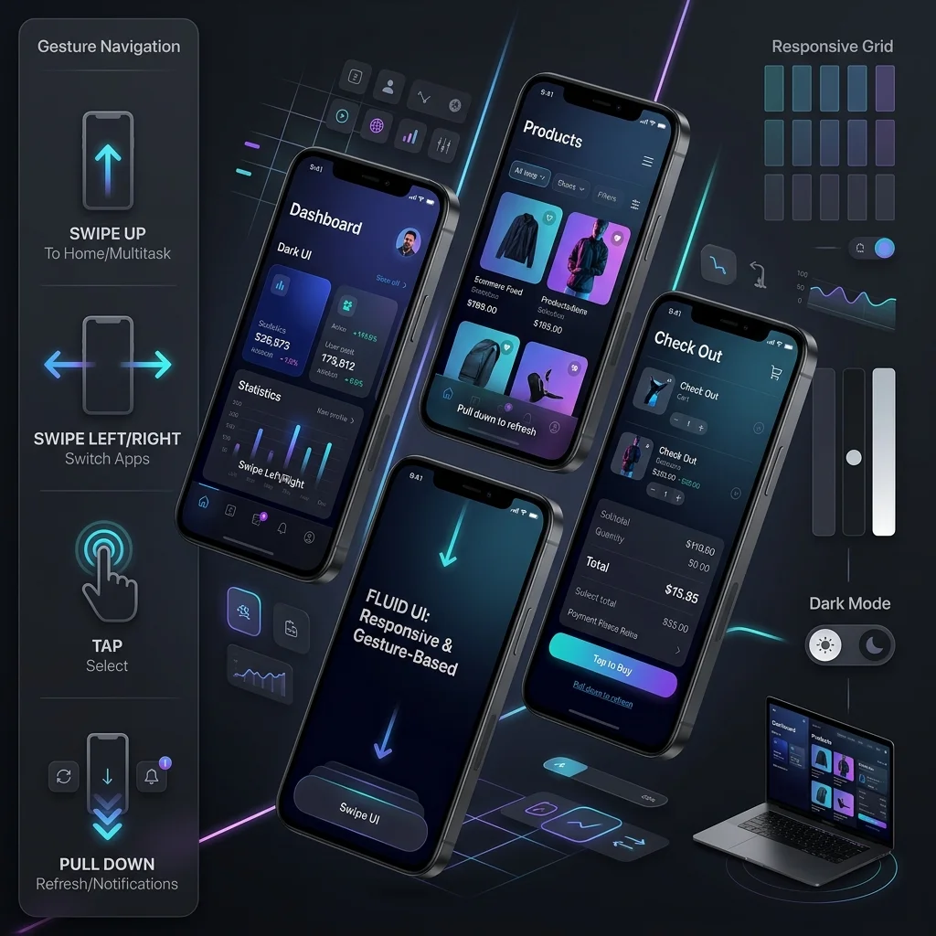
The web design landscape in 2026 is defined by a productive tension: interfaces are getting more expressive while performance budgets are getting tighter. The trends below aren’t aesthetic flavor — each one has measurable implications for Core Web Vitals, accessibility compliance, and conversion rates. Here’s what’s actually shipping on high-performing sites this year.
1. AI-Assisted Design Workflows
Use AI in design workflows for acceleration, not delegation: generate wireframe variations, realistic placeholder copy, and concept imagery fast, then apply human art direction to whatever survives critique. The teams shipping well in 2026 treat model output as raw material for decisions, never as the final visual language.
- Rapid prototyping: AI layout generators produce 5–10 wireframe variations in minutes, letting designers test information hierarchy before committing to a direction.
- Copy and placeholder generation: realistic text and data in mockups replaces lorem ipsum, catching real-world layout problems (long German compound words, short Persian strings) earlier.
- AI image generation as concept art: moodboards and hero concepts are AI-drafted, then refined by human illustrators or photographers for the final asset.
- Component scaffolding: design-system-aware tools generate Figma components or CSS skeletons from text descriptions, cutting hours from routine pattern production.
The critical risk: AI-generated designs converge on the same visual average. Sites built entirely from AI suggestions look interchangeable, which erodes brand distinctiveness. Use AI for exploration speed, then apply human art direction for the final expression.
2. Brutalism vs. Minimalism: The Design Tension of 2026
Minimalism and brutalism are the two registers dominating 2026 layouts, and the sites that win blend them rather than picking a pole: calm whitespace and typographic hierarchy for the structure, one raw or exposed element for character. Purity on either extreme trades usability for style.
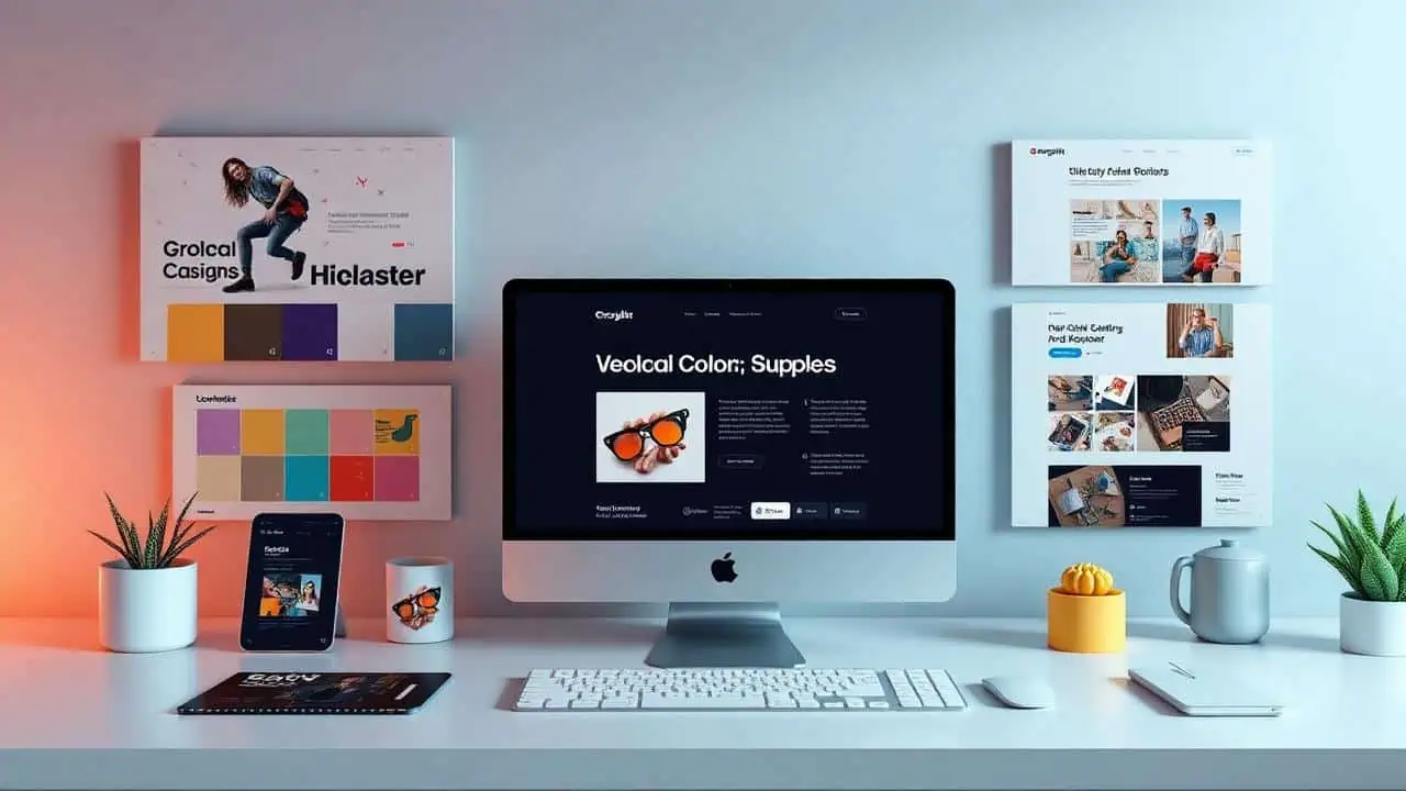
Two opposing visual languages are dominating high-traffic sites right now:
- Minimalist refinement: generous whitespace, restrained color palettes, subtle shadows, and typography-driven hierarchy. Converts well for professional services, SaaS, and luxury brands where trust and clarity are the product.
- Brutalist rawness: exposed structure, heavy borders, monospace accents, deliberate asymmetry, and anti-polish aesthetics. Performs surprisingly well for creative agencies, indie products, and developer-facing brands where personality signals authenticity.
The strategic insight: these aren’t opposites to choose between — they’re register settings on the same dial. A fintech landing page can use minimal layout with one brutalist accent (a raw data table, exposed grid lines) to signal technical depth. A creative studio can use brutalist structure with minimalist refinement on its contact form so the conversion path stays frictionless.
The common failure mode is aesthetic purity: sites that commit 100% to either extreme sacrifice usability for style. The best 2026 sites borrow deliberately from both.
3. Modular Layouts: Bento Grids and Asymmetric Structure
Modular layout systems — bento grids, card mosaics, asymmetric column spans — are how 2026 pages organize mixed content without clutter: each block is a self-contained unit with its own visual weight, and the grid absorbs a new section later without a redesign. Define spans with container queries and fluid gaps rather than fixed breakpoints.
What separates a working modular grid from a widget tray:
- When it fits: feature summaries, dashboards, portfolio indexes, pricing overviews — content that is genuinely parallel. Sequential narrative still wants a single column.
- Hierarchy by span, not by color: the most important cell gets the largest area; color stays reserved for one accent so size does the ranking.
- One spacing step: consistent gutters on every cell edge. Uneven gaps read as a rendering bug rather than a decision.
- Nesting ceiling: one level of cards inside a cell is the limit before the structure turns into card soup.
The failure mode is boxing everything: when every paragraph sits in a bordered card, the eye has no way to rank the content and the page reads as a tray of widgets instead of an argument. Reserve cards for genuinely discrete objects — a feature, a quote, a metric — and leave prose on the open canvas.
4. Typography as Layout: Fluid Scales and Variable Fonts
Typography is doing the work imagery used to do: one fluid type scale set with clamp() so headings step down smoothly between breakpoints, oversized display weights carrying the hero, and variable fonts delivering several weights from a single file. Set a comfortable measure, cap line length, and the layout needs fewer containers to hold together.
- Fluid type with
clamp(): a min/max pair per step replaces breakpoint-specific font sizes, so headlines never jump or overflow between breakpoints. - Variable font axes: weight and width variations ship inside one download instead of a stack of separate files, which cuts both payload and render-blocking requests.
- Display type as the hero: a headline set at expressive scale with a tight lockup replaces stock photography — cheaper, faster, and more distinctive than an image nobody remembers.
- Bilingual pairings: where a site serves Arabic and Latin scripts, choose families that hold weight parity across both, so the RTL page does not look like a different brand.
The failure mode is an ad hoc type scale: sizes invented per component until the page has nine heading sizes and no rhythm. Define the scale once in the design system, express it in relative units, and every new section inherits the hierarchy.
5. 3D and WebGL Accents — With a Performance Budget
Three-dimensional elements and WebGL effects are back, shipped as progressive enhancement with a hard asset budget: the page must be interactive and readable before any scene loads, and decorative depth starts only once interaction is available. Add a scene the network cannot afford and the aesthetic gain is spent on load time before a visitor scrolls.
- Progressive enhancement: load the 3D scene or shader after the page is interactive, never blocking the critical rendering path. Use
requestIdleCallbackor lazy-scroll-triggered initialization so the decorative layer never delays usability. - Fallbacks for low-power devices: detect
DeviceMemoryandhardwareConcurrency(orprefers-reduced-data) to serve a static image or CSS gradient instead of a 3D scene on constrained hardware. - Budget the asset weight: a single hero 3D model or video background should cost no more than 500KB–1MB total. Beyond that, the LCP and INP penalties erase the aesthetic gain.
- Static-first delivery: many “3D” effects can be replaced by carefully baked CSS
clip-path,mask-image, or layered gradients that achieve depth at 1/10th the payload. Reserve true WebGL for interactions that genuinely need it.
Experiment with lightweight depth effects using our CSS Gradient Generator or Box Shadow Generator before pulling in a JavaScript 3D library.
6. Color, Texture and Material Detail
Palettes in 2026 are quieter and more deliberate: one restrained base, a single accent used sparingly, and texture — grain, noise, layered gradients — doing the work heavy imagery used to do. Every pair still has to clear contrast in both light and dark themes before it ships.
- Grain and noise as lightweight material: an SVG or CSS noise overlay adds surface and depth for a few hundred bytes, where a photographic texture would cost an image request.
- Gradients for depth, not decoration: layered radial gradients behind a section create separation without borders or shadows; the failure is a rainbow behind body copy, which fails contrast the moment the text crosses the light band.
- Accent scarcity: one accent color, used for actions only. When every element is emphasized, nothing reads as clickable.
- Test both themes: a palette that passes on white frequently fails on dark, so validate each foreground/background pair — including hover and disabled states — with our free Color Contrast Checker.
Texture and restraint do more for perceived quality than another illustration. The page stays fast because the material is generated, not downloaded.
7. Accessibility as a Design Feature (WCAG 2.2)
WCAG 2.2 turned accessibility into a design constraint that improves every interface: visible focus states designed as intentional elements, minimum touch-target sizes, reduced-motion alternatives for anything that moves, and navigation that stays in the same order on every page. Specify these once in the component library and every page inherits them.
- Focus indicators: WCAG 2.2 requires visible focus states on all interactive elements. The trend is to design these as intentional visual elements — bright outlines, offset rings, or background inversions — rather than browser defaults.
- Target size minimums (AA): touch targets must be 24×24 CSS pixels minimum. This kills the old 16px icon button and forces cleaner spacing and larger hit areas, which benefits all mobile users.
- Reduced motion support:
prefers-reduced-motionmedia queries are now standard. Parallax, autoplaying animations, and scroll-jacking must have instant or minimal-motion alternatives. - Consistent navigation (2.2 new criterion): repeated navigation patterns must appear in the same relative order across pages. This forces consistency that users of assistive technology (and all users) benefit from.
Design accessibility into the component library from day one: dark-mode contrast pairs, focus ring specs, reduced-motion variants, and minimum target sizes should be documented in the design system, not patched onto individual pages.
Validate every color pair across both light and dark themes with our free Color Contrast Checker.
8. Sustainable Web Design: Low-Carbon by Default
Sustainable web design and performance are the same optimization: lighter images, efficient hosting, fewer font files, and dark surfaces on OLED all cut energy per page view while cutting load time. Treat every kilobyte as a design decision with a cost on the network, the device, and the server.
- Optimize image delivery: AVIF/WebP formats, responsive
srcset, and lazy loading reduce page weight — which translates directly to lower data-center and network energy per page view. - Efficient hosting: green-certified hosting or CDN edge caching (which our Web Development services configure by default) reduces server energy draw and improves TTFB simultaneously.
- System fonts and variable fonts: skipping custom font downloads saves 50–200KB per page and reduces rendering energy on the client device.
- Dark mode for OLED efficiency: on OLED screens, dark mode can cut display energy consumption by 40–60% — a measurable sustainability feature, not just a user preference.
Every KB you save is lighter on the network, faster for the user, and cheaper on the server. Sustainability and performance are the same optimization problem.
9. Micro-Animations With prefers-reduced-motion Discipline
Motion is visual polish rather than spectacle: state feedback on press, hover, loading, and validation, animated only through transform and opacity, capped around 150–400ms, and disabled under prefers-reduced-motion. Animation earns its place when it confirms what just happened — anything longer is decoration that slows the interface down.
- State feedback: buttons that compress on press, loading spinners, inline form validation, and hover states that confirm interactivity — these reduce error rates and perceived abandonment.
- Compositing-only animation: animate
transformandopacityexclusively. Animatingwidth,height,top, orlefttriggers layout reflow and jank. - Prefers-reduced-motion implementation: the CSS media query is now table stakes:
@media (prefers-reduced-motion: reduce) {
  * {
    animation-duration: 0.01ms !important;
    animation-iteration-count: 1 !important;
    transition-duration: 0.01ms !important;
  }
}
Users who opt into reduced motion get instant state changes; everyone else gets polished feedback. Both experiences feel intentional.
- Duration ceiling: purposeful animations complete in 150–400ms. Anything longer is decoration, not feedback, and harms perceived speed.
Conclusion
The defining web design capability in 2026 isn’t a visual style — it’s intentional constraint: AI-accelerated workflows, brutalist or minimalist expression tempered by usability, fluid type and modular grids instead of stock imagery, 3D accents that respect performance budgets, WCAG 2.2 accessibility built into the system, sustainability that overlaps with speed, and animation that respects both power and preference.
If your current site hasn’t been audited against WCAG 2.2, Core Web Vitals, or a modern design-system approach to consistency, our Custom Web Design services rebuild experiences with these constraints in mind from the first wireframe. Contact WebABC to discuss your redesign.
References and Further Reading
The claims in this guide trace back to primary sources rather than trend roundups: W3C for the accessibility criteria, MDN for the reduced-motion syntax, web.dev for the Core Web Vitals thresholds, and the Nielsen Norman Group for the usability principles behind the interface recommendations. Each link below goes to the standard, specification, or research page itself.
- W3C — Web Content Accessibility Guidelines (WCAG) 2.2: the W3C Recommendation standard referenced throughout this guide, including the target-size, focus-appearance, and consistent-navigation criteria discussed above.
- W3C Web Accessibility Initiative — What’s New in WCAG 2.2: a plain-language summary of the nine new success criteria introduced in 2.2.
- W3C — CSS prefers-reduced-motion: MDN reference for the media query behind reduced-motion design (WCAG criterion 2.3.3).
- Google web.dev — Learn Core Web Vitals: the authoritative reference for the LCP, INP, and CLS metrics that make performance a design constraint.
- Nielsen Norman Group — 10 Usability Heuristics for User Interface Design: the foundational UX principles that underpin accessibility-friendly, conversion-focused interface design.