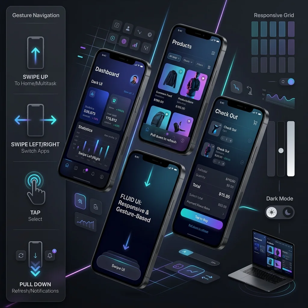
With over 60% of web traffic coming from mobile devices, mobile-first design is the discipline of deciding what your product is when the screen, the bandwidth and the user’s attention are all at their smallest — and then building outward from there. This guide covers the strategy and the principles: what the approach actually means, when to choose it over plain responsive design, the rules that govern the layout, and the workflow that keeps a team honest about it.
What is Mobile-First Design?
Mobile-first design means designing for mobile devices first, then progressively enhancing the experience for larger screens. You start from the narrowest viewport and the slowest connection, decide what belongs there, and treat every larger screen as an opportunity to add — never as the default that mobile then has to survive.
The practical difference is in what you design first. A desktop-first team sketches the full page, then asks what to remove at 375 pixels; a mobile-first team sketches the single column, then asks what the extra space at 1440 pixels is for. The second question is easier to answer honestly, because the content that survives the small screen is the content users came for.
Three terms get used interchangeably here, and they are not the same thing:
- Mobile-first: the design sequence. Small screen layouts are authored first, and larger layouts are written as additions on top of them.
- Responsive design: the mechanism. Fluid grids, flexible images and media queries let one document reflow across viewports. A site can be responsive without being mobile-first — if the underlying layout was conceived for desktop.
- Progressive enhancement: the delivery rule. Core content and functionality work on the weakest device in your audience, and stronger devices get extra capability rather than the reverse.
Mobile-First vs. Responsive Design: Which Do You Need?
Choose mobile-first when the majority of your traffic, your content hierarchy or your conversion path lives on a phone; choose desktop-first responsive when the product is genuinely used on wide screens. The decision is about where the work happens, not about which technique is more modern.
| Decision criterion | Mobile-first | Desktop-first responsive |
|---|---|---|
| Audience device mix | Majority mobile, or mobile-dominated at conversion | Specialist, internal or professional tools |
| Content shape | Reads naturally as one prioritized column | Dense tables, dashboards, multi-pane layouts |
| Performance budget | Constrained — cellular networks, mid-range hardware | Generous — office connections, powerful machines |
| Failure mode if skipped | Squashed desktop page, unusable controls | Unlikely — wide layouts scale down predictably |
| Rewrite cost later | Low: enhancements layer on top | High: hierarchy must be rethought for one column |
Most marketing sites, stores and service businesses land firmly on the mobile-first side: the traffic mix is mobile-heavy, the content is narrative, and Google evaluates the mobile version of the page first. Data-heavy internal applications sometimes land the other way, and that is a legitimate outcome of the framework rather than a shortcut.
The third option — a separate m-dot site — is almost never the answer today. It doubles your maintenance, splits your ranking signals between two URLs, and forces every link equity decision to be made twice. One responsive document, designed from the small screen up, avoids all three costs.
Why Mobile-First Matters in 2026
Mobile-first matters because Google evaluates the mobile version of your site and users judge you by the apps on the same phone. A desktop layout that merely shrinks down loses crawlers content, loses users their patience, and loses the page its ranking — on every device, not only the small one.
1. Google’s Mobile-First Indexing
Google primarily uses the mobile version of your site for indexing and ranking. A poor mobile experience directly damages your organic visibility across both desktop and mobile search — the desktop rendering is no longer a safety net, because the mobile DOM is what gets crawled and evaluated. Integrating our technical SEO services and local SEO strategies ensures your mobile DOM matches indexing requirements.
The failure is usually structural rather than cosmetic. Content that exists only in desktop-only sidebars, lazy-loaded sections that never resolve on a narrow viewport, or navigation that requires hover all mean the crawler sees less than your desktop users do — and pages rank for the content the crawler saw.
2. User Expectations
Users expect fast, seamless mobile experiences. Slow or poorly designed mobile sites lead to:
- Higher bounce rates
- Lower conversions
- Reduced engagement
- Negative brand perception
Expectations are set by the apps on the same device, not by your competitor’s website. A user who just used a native app that responds instantly will judge your page by that standard, which is why a merely acceptable mobile site now reads as a slow one.
3. Performance Benefits
Mobile-first forces you to prioritize, and the prioritization is the value: deciding what is essential is a design act that benefits every device, not only the smallest one.
- Essential content
- Optimized images (AVIF/WebP)
- Minimal code
- Fast loading times (learn more in our website speed optimization services and see how we delivered 0.4s mobile load times in our London Rug Cleaning case study)
Key Principles of Mobile-First Design
Four principles govern the layout: rank content for one column, size controls for fingers, treat performance as a design constraint, and enhance upward from a working base. Each one is a decision made before the visual design starts, which is why they hold across frameworks and screen sizes.
1. Content Hierarchy
Prioritize content based on mobile user needs — the single column forces a ranking that the wide layout can otherwise hide:
- Most important content first
- Clear, scannable headlines
- Concise paragraphs
- Strategic use of white space
When you cannot decide what comes first, you do not have a layout problem, you have an editorial one. Write the one sentence the page must communicate, put it above everything else, and let the layout follow from it.
2. Touch-Friendly Interface
Design for fingers, not cursors. The pointer is imprecise, the hand covers the control it is about to press, and there is no hover state to preview an action with:
- Minimum touch target size: 44x44 pixels
- Adequate spacing between interactive elements
- Clear visual feedback for interactions
- Easy-to-reach navigation (test visual contrast ratios with our Color Contrast Checker)
Reach matters as much as size. Primary actions belong in the lower two-thirds of the screen where a thumb can rest, and destructive actions (delete, cancel order) should be hard to hit by accident rather than convenient to reach.
3. Performance Optimization
Speed is critical on mobile, and the constraint is physical: radios wake, connections negotiate, and mid-range hardware parses what you send it.
- Optimize and compress images
- Minimize HTTP requests
- Use lazy loading
- Implement browser caching
- Minimize CSS and JavaScript
Treat the performance budget as a design constraint rather than a post-launch task. If a proposed feature cannot fit the budget on a mid-range phone, it does not ship — the negotiation happens before the design is approved, not after the page is already slow.
4. Progressive Enhancement
Start with core functionality, then add:
- Enhanced features for larger screens
- Advanced interactions
- Additional visual elements
- Complex layouts
The discipline is in the order. Every enhancement you add for desktop must degrade cleanly when it is absent, so a broken script, a blocked CDN or an unsupported browser leaves a working page behind — not an empty container waiting for JavaScript.
Mobile-First Development Workflow
Work in three phases in this order — strategy, design, development — because the sequence is what makes the result mobile-first rather than mobile-tolerant. As part of our custom web design process, each phase locks its decisions before the next one opens, so mobile is never retrofitted into a desktop comp.
1. Strategy Phase
- Define mobile user goals
- Identify key user journeys
- Prioritize features and content
- Plan information architecture
2. Design Phase
- Create mobile wireframes first
- Design mobile mockups
- Test with real users
- Refine based on feedback
3. Development Phase
- Build the single-column base before any enhancement
- Layer larger-screen rules on only where the content breaks
- Test on real devices
- Optimize performance continuously
The workflow only produces a mobile-first result if the phases stay in that order. Teams that design desktop first and “also do mobile” in development end up maintaining two layouts with half the budget — the phase discipline is the whole method. For the CSS mechanics of writing small-screen styles first, see our mobile-first web design implementation guide.
Mobile-First Content Strategy for Small Screens
Mobile-first content means editing for the column: one argument per screen, one action per section, and nothing essential hidden behind a control the reader has to discover. The layout cannot fix copy that was written for a wide page, so the writing has to change first.
What this looks like in practice:
- Lead with the answer. The first paragraph must stand alone — a reader on a phone decides within a screen whether to keep going.
- Short paragraphs, real headings. Two to four sentences per paragraph keeps the vertical rhythm scannable on a narrow viewport.
- Collapse deliberately. Accordions and tabs are for genuinely secondary material. Anything you hide inside one stops existing for both readers and crawlers until they open it.
- Write links that make sense out of context. On mobile a link is a context switch to another app-sized screen; anchor text should say where it goes.
- One primary action per view. Competing calls to action split a decision the reader is already making with one thumb.
Tables, dense comparisons and code samples deserve special attention: they are the elements most likely to force horizontal scrolling, which is the single most common reason a mobile reader abandons a page.
Common Mobile-First Mistakes to Avoid
Eight mistakes account for most failed mobile-first projects: hidden content, tiny text, intrusive pop-ups, sideways scrolling, fixed chrome, hover-only menus, wide-only widgets, and single-device testing. None is exotic, and each one is invisible in a desktop demo — which is exactly why they ship.
- Hiding important content: don’t hide critical information on mobile — if it matters enough to show desktop users, it matters enough to structure for the phone.
- Tiny text: use readable font sizes (minimum 16px), and don’t rely on the reader pinch-zooming to decode your pricing.
- Pop-ups: avoid intrusive interstitials on mobile; they cover the very content the visitor came for.
- Horizontal scrolling: never require horizontal scrolling for primary content — a sideways swipe on a phone reads as a broken page.
- Fixed elements: be careful with fixed headers and footers that consume the viewport and trap the controls underneath them.
- Hover-dependent navigation: a menu that only opens on pointer-over does not exist on a touch device.
- Desktop-only widgets: maps, calendars and embeds that need a wide canvas will render as an unusable sliver in a single column.
- Testing on one device: an emulator pass on a flagship phone misses the mid-range hardware and the weak signal your actual audience uses.
Testing Your Mobile Design
Test on real devices, real networks and one uninvolved user — emulators confirm layout, but they hide the hardware, signal and habits your audience actually has. The checklist below is the minimum pass before a release; run it again whenever the template changes.
- Test on real devices, not just emulators
- Check various screen sizes
- Test different network speeds
- Test touch interactions, including one-handed reach
- Validate with Google Mobile-Friendly Test
Add two habits to the checklist. First, test on a throttled connection with the device’s battery saver on — that approximates the conditions most of your mobile traffic is actually under. Second, hand the phone to someone who did not build the site and watch them complete your primary task without instruction; the places they hesitate are your real defect list.
Measuring Mobile-First Success
Measure the mobile experience separately from the site average, because aggregate reporting hides exactly the regressions mobile-first design exists to prevent. Report mobile and desktop side by side for every metric below, and treat a widening gap as a defect rather than a rounding error.
Metrics worth tracking, in the order they usually reveal a problem:
- Task completion on mobile — can a first-time visitor finish the primary journey, from landing to conversion, without switching to a desktop?
- Search Console mobile usability — coverage of the specific pages Google flags, tracked as a count that should only ever fall.
- Core Web Vitals split by device — the field metrics Google uses for ranking, read on the mobile segment where the design lives or dies.
- Mobile conversion rate against desktop — the ratio matters more than either absolute number; a wide gap tells you the desktop layout is doing work the mobile one is not.
- Scroll and interaction depth — whether readers reach the sections you ranked first in the content hierarchy.
Review these on a fixed cadence, after every significant release, and keep a change log. Without one, a mobile regression three months after a redesign is undiagnosable — everything moved, so nothing can be blamed.
Conclusion
Mobile-first design is a sequence and a set of constraints, not a slogan: decide the small screen first, let progressive enhancement add the rest, and hold the team to the phase order that makes it real. The result reads better on every device — content that survives a narrow column was always the content worth showing.
Explore our custom web design services and website speed optimization services, or preview how your mobile snippet renders with our free SERP Preview Tool.
Ready to go mobile-first? Contact WebABC to transform your website with modern mobile-first design strategies.