Modern interface design in 2026 sits at the intersection of visual craft and ruthless performance discipline. The trends below aren’t decoration for decoration’s sake — each one measurably affects engagement, conversion, and Core Web Vitals when implemented correctly (and hurts all three when implemented carelessly).
1. Glassmorphism: Depth Without Visual Weight
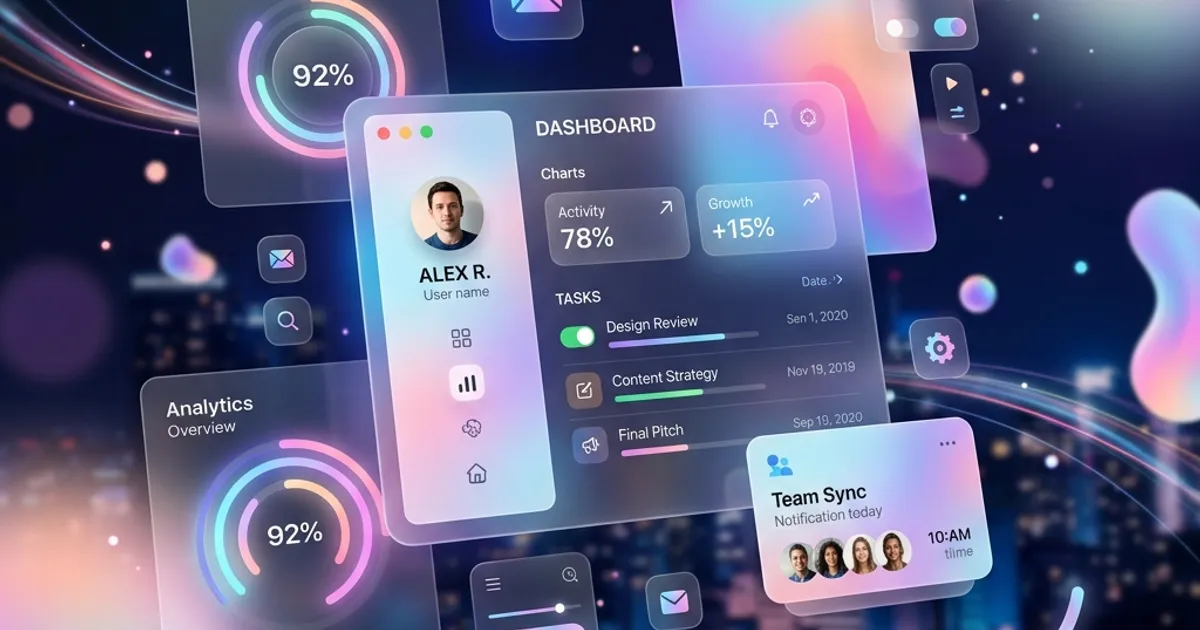
Glassmorphism — frosted-glass cards with semi-transparent backgrounds, subtle backdrop-filter: blur(), and hairline borders — remains one of the most effective ways to layer information on top of imagery or gradients without breaking visual hierarchy.
Done well, it creates a premium feel for dashboards, pricing cards, and hero overlays. Done poorly, it murders readability and GPU performance. The rules we apply in production:
- Blur budget: keep
backdrop-filterblur between 8–20px. Excessive blur on large surfaces forces expensive GPU repaints on scroll. - Hairline borders: a 1px border at
rgba(255,255,255,0.2)defines the edge where the blur fails, especially over light backgrounds. - Fallbacks matter: on browsers without backdrop support, the card must degrade to a solid, readable surface. Never leave text on a blurred background that renders as pure transparency.
- Layering discipline: glass over glass over imagery creates muddy contrast. One glass layer per viewport region is usually enough.
Build and copy production-ready glass card CSS with our free Glassmorphism Generator.
2. Micro-Interactions: Small Animations, Measurable Retention
A micro-interaction is a single-purpose animation attached to one user action: a button that compresses on press, a heart that bursts when tapped, a form field that shakes gently on invalid input. These aren’t decoration — they’re feedback, and interfaces without feedback feel broken.
High-value micro-interactions to prioritize:
- Button states: hover lift, active press-down, and a 200–300ms loading spinner state. Users who see immediate response after a click are far less likely to double-submit forms.
- Form validation: inline, as-typed feedback (green check on valid email, red underline on error) reduces form abandonment significantly versus submit-time-only validation.
- Skeleton loading screens: animated placeholder blocks outperform spinners for perceived speed — the user sees structure before content arrives.
- Page transitions: subtle 150–250ms fades or slides between views maintain spatial context; hard cuts feel jarring on app-like sites.
Technical guardrails: animate only transform and opacity (compositor-only properties, zero layout cost), keep durations under 400ms, and always wrap animations in a prefers-reduced-motion media query so users with vestibular sensitivity get instant state changes instead of motion.
3. Dark Mode Strategy: More Than Inverted Colors
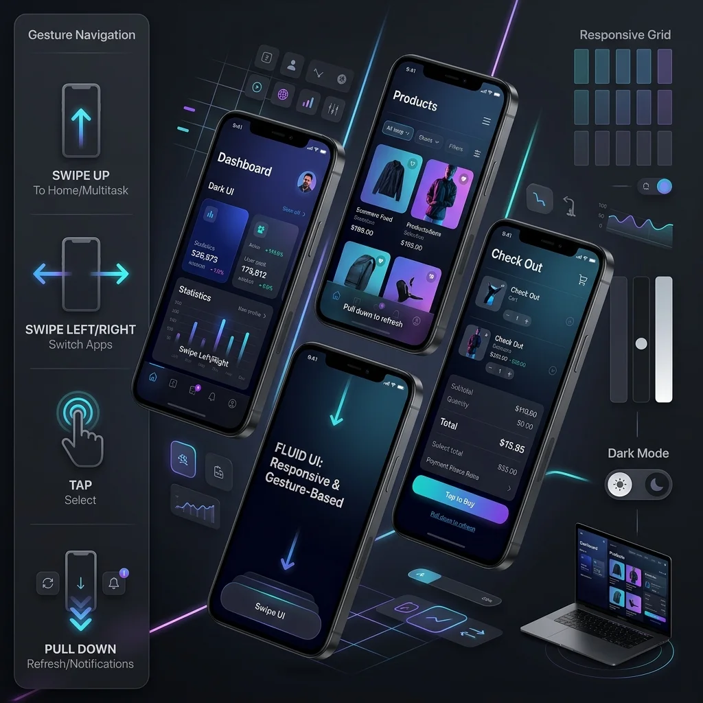
Dark mode is no longer a novelty — a large share of users have it enabled at the OS level, and sites that ignore prefers-color-scheme deliver a blinding white page in a dark environment. But real dark mode strategy is a design system decision, not a CSS inversion:
- Detect the system preference first with
@media (prefers-color-scheme: dark), then offer a manual toggle persisted inlocalStorage. The toggle wins; the system is the default. - Don’t use pure black (#000) for backgrounds. Pure black causes smearing on OLED screens and harsh contrast. Use a desaturated dark gray-blue (
#0d1117-style range). - Desaturate your accents: brand colors that pop on white often vibrate painfully on dark. Reduce saturation 10–20% for the dark palette.
- Elevation replaces shadows: in dark mode, shadows are nearly invisible. Communicate depth with lighter surface colors — the higher the component, the lighter the gray.
Test both themes separately for contrast compliance — a palette that passes WCAG on white frequently fails on dark.
4. Accessible Contrast Is a Conversion Feature
WCAG 2.2 requires a 4.5:1 contrast ratio for body text and 3:1 for large text (user interface components need 3:1 against adjacent colors). This is not just a legal and ethical floor — high-contrast interfaces measurably improve readability for everyone, on dim screens, in sunlight, and for the roughly 1 in 12 men with some form of color vision deficiency.
Common failures we find in audits:
- Light gray placeholder text (
#9ca3afon white passes AA for large text only — body copy at that color fails). - White text on saturated brand-color buttons that sit at 3.8:1, just under the threshold.
- Gradient text that passes at the top and fails at the bottom.
Validate every foreground/background pair in your palette — including hover states, disabled states, and both light and dark themes — with our free Color Contrast Checker.
5. Performance vs. Beauty: A Budget, Not a Choice
The single most damaging pattern in modern design work is treating performance as a developer cleanup task after design sign-off. Every aesthetic decision carries a weight cost, and the correct process is to budget that cost before the visual concept is locked:
- Hero video: budget it against your LCP target of 2.5s. A 4MB autoplaying hero video almost always means a failing LCP on mobile — consider a compressed poster image with video loaded on interaction.
- Font loading: each additional font weight adds layout shift risk and render-blocking time. Two families, two weights each, with
font-display: swapis the ceiling for most sites. - Third-party scripts: every chat widget, analytics tag, and social embed eats into your INP budget. Audit them quarterly and load anything non-critical after interaction.
- CLS from late-loading media: always set explicit
width/heightor aspect-ratio on images and embeds so nothing jumps.
A beautiful site that takes 5 seconds to become usable is not beautiful — it’s abandoned. Google ranks the experience, and users vote with the back button.
6. AI-Personalized Interfaces: Adapt the Surface, Not the Skeleton
AI-driven personalization has matured past simple “Hello, [name]” tokens. High-performing implementations in 2026 adapt interface elements to user behavior and context while keeping the underlying structure stable and crawlable:
- Content ordering: returning visitors see the CTA variant that previously converted; first-time visitors get the educational variant.
- Contextual CTAs: a service page read by a local visitor surfaces a location-specific offer rather than a generic contact button.
- Personalized recommendations on blogs and e-commerce pages, rendered server-side or streamed in above the fold.
The critical rule for SEO: personalize within a stable DOM, never swap primary content client-side in ways that differ radically from what crawlers see. Googlebot should always receive the canonical, fully-formed page; personalization enhances, never replaces, the crawlable baseline. Cloaking adaptations — showing search bots different content than users — violates Google’s guidelines and risks deindexing.
Conclusion
Modern UI/UX in 2026 is a discipline of constraint: glassmorphism within a blur budget, animations under 400ms, dark mode as a designed palette rather than an inversion, contrast validated on every state, and personalization that never hides content from crawlers. The sites that win are the ones where design and performance were planned together from the first wireframe.
If your interface looks great but converts poorly, scores red on Core Web Vitals, or hasn’t been pressure-tested against WCAG 2.2, our UI/UX Design Audit service pinpoints exactly where visual decisions are costing you users — and our Custom Web Design service rebuilds the experience end to end. Contact WebABC for a design consultation.
References and Further Reading
- Google web.dev — Learn Core Web Vitals: the authoritative reference for the LCP, INP, and CLS budgets referenced throughout this guide.
- Google web.dev — How the Core Web Vitals metrics thresholds were defined: the research behind the 2.5s LCP, 200ms INP, and 0.1 CLS targets.
- W3C — Web Content Accessibility Guidelines (WCAG) 2.2: the conformance standard for contrast, focus states, and reduced-motion support in modern interfaces.
- W3C WAI — WAI-ARIA Overview: Web Accessibility Initiative recommendations for accessible interactive widgets and dynamic content.
- W3C — CSS prefers-reduced-motion: MDN reference for motion-preference handling (WCAG criterion 2.3.3).
- Nielsen Norman Group — 10 Usability Heuristics for User Interface Design: the foundational UX heuristics that turn visual trends into usable interfaces.
- Google Search Central — Spam Policies for Google Web Search: the cloaking and deceptive-practices requirements referenced in the AI-personalization section.